


Latest News
Moe.Down XVI poster…

This past weekend was MOE.’s big Moe.Down XVI Music Festival show in Turin, NY and I had the privilege of being asked to do a print for the event. I have worked with MOE. in the past on numerous posters including one for their Snoe.Down Music Fest & Summer Camp Music Fest but never the big MOE.Down shindig.


The final print is a 6-color screenprint (18′ x 24′) printed by the kickass folks at Monolith Press with a run of 50 for the promoter/venue, and I will have available a small run of 25 Artist Prints (signed/Numbered) starting July 5th @ 11am (PST).


Along with the main run I printed up and will have 3 different foil variants available. A “Rainbow Foil” with a print run of 100, and a “Lava Foil” & the “Sparkle Foil” both of which with an extremely limited run of only 10.

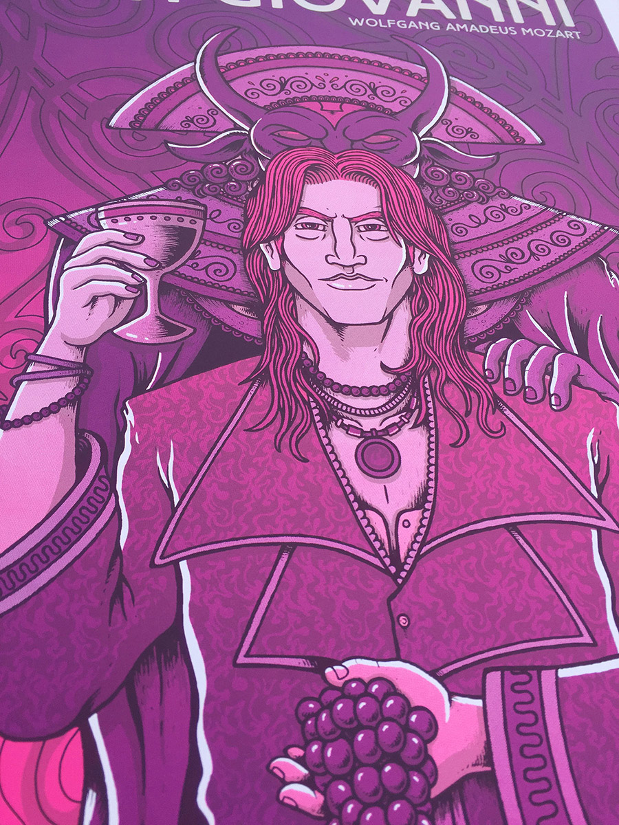
SF Opera “Summer of Love” posters…
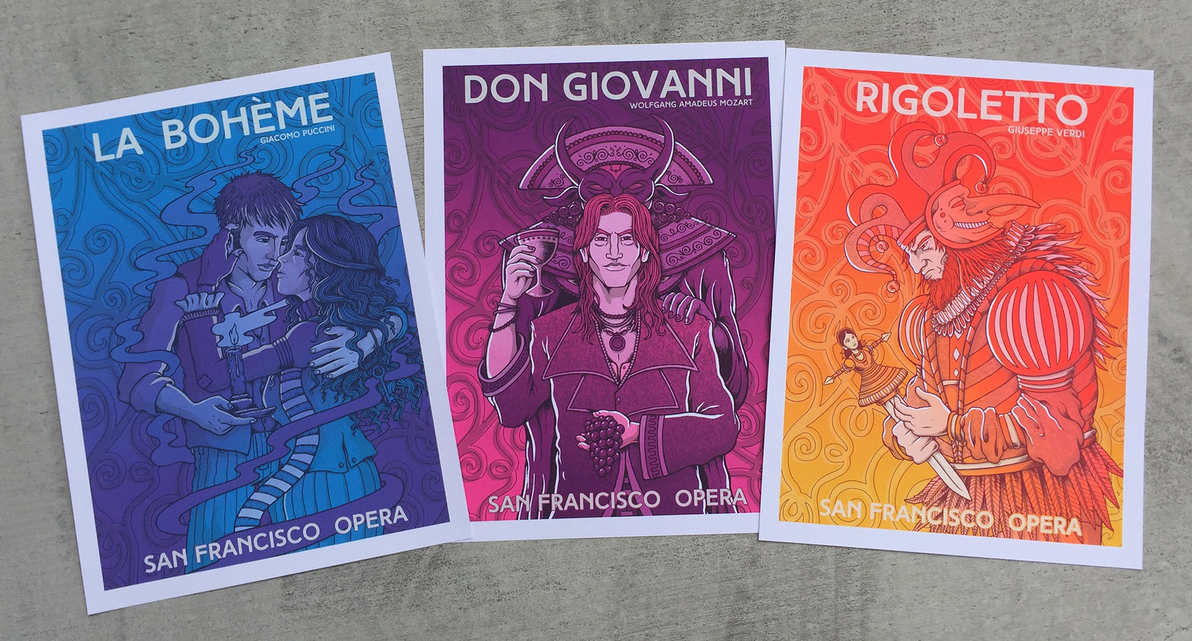
I am pleased to announce I will be releasing a set of limited art prints featuring my work with the SFOpera’s “Summer of Love” campaign. The artwork which is currently being used and promoted around San Francisco has been well received and creating a limited screenprinted version was a must, though no easy task.
The original art wasn’t necessarily created with a screenprint in mind and features numerous colors and gradients. Deconstructing the art and simplifying it to a limited color scheme was quite tricky but with the help of print shop, The Half & Half we got it done and the prints came out vibrant and powerful.


Each print is 18’x 24′ and has a print run of 100. 75 of each to the Opera, & I will be selling my limited set of 25 copies. They will be sold individually and as a set…

Moonalice poster,… Applegate, OR.

I recently wrapped up my first poster for the Bay Area band, Moonalice for their show this week up in Applegate, OR. The band has a long history here in the Bay Area and is big proponent of the revival and continuation of the classic 60’s poster art scene. A while back they decided to create posters for each of their shows and have now amassed quite the poster collection (950+ posters) featuring a number of the all-time greats (Stanley Mouse, Wes Wilson, Lee Conklin, David Singer, Gary Houston, Chuck Sperry, etc..).

I wanted my print to represent the colors and feel of a warm Summery day in Southern Oregon with lots of green-tones and yellows. The central figure is my take on a kind of Cosmic nature goddess and of course I had to rep my redhead peoples. The band was very easy to work with and I’m thrilled to be a part of the series.

The print is a lithograph (12.75′ x 17.25′) and was handed out to folks at the show. I will have an Artist print run (signed/Numbered) available starting June 21st.


LATEST COMMENTS