Latest News
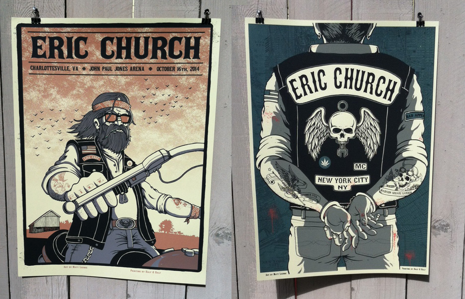
Eric Church posters… Charlottesville & NYC 2014!!
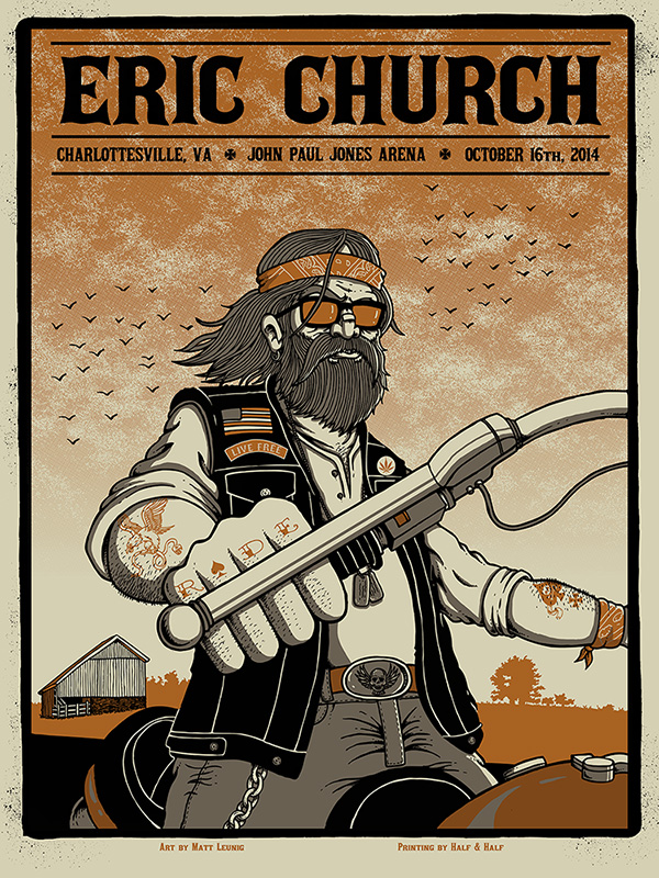
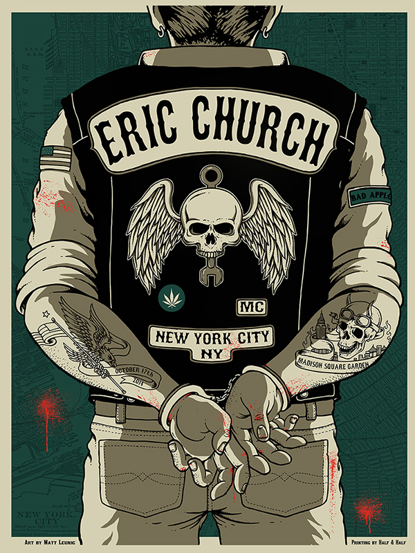
There are a few bands that I have been lucky enough to engrain myself into their fold and have been giving me business year after year. Eric Church is one of them and with a new tour and a new album I was given the task of doing 3 prints for 3 big tour stops,… Charlottesville, NYC (Madison Square Garden) & Philadelphia. Country music is not necessarily my forte but I have always embraced the opportunity it gave me to introduce myself to a new audience. With this tour EC & the boys were going with that of a biker/American outlaw motif which brings to mind whiskey, weed, motorcycles & bar fights. Stuff out of Hunter S. Thompson’s “Hells Angels” book.
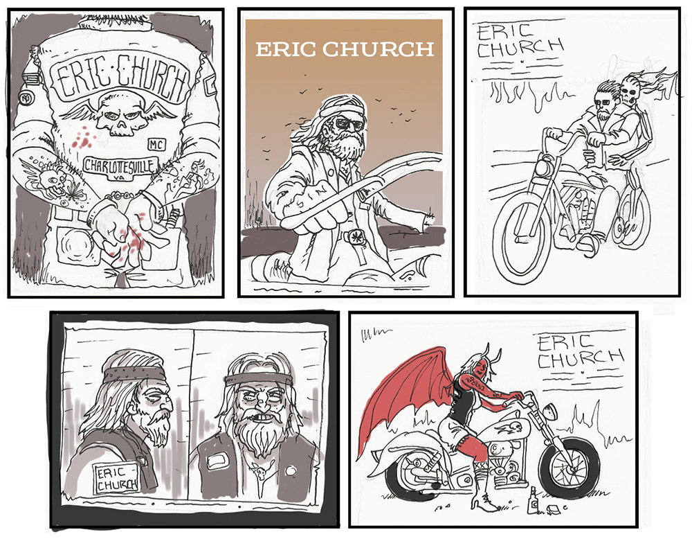
I live in Oakland and the legacy and imagery of the old Hells Angels is pretty strong here. I started off with a slew of sketches, not necessarily with specific cities in mind but wanted to skew more toward the look of the 60’s & 70’s bike clubs. I usually go apeshit with color but with all of the Church posters I’ve done, I think 8 or 9 total now, I’ve tried to use a limited color palette and simplified design. Well,… simplified for me.
Charlottesville isn’t necessarily seen as a biker kinda town but it is surrounded by miles of beautiful highways and roads through the Appalachian & Shenandoah Mountains. Lots of farmland and open skies…. basically good riding.
The New York City vibe had to be totally different. More gritty and concrete. Nothing like some bloody knuckles and handcuffs. Unfortunately the 3rd poster design was completed but the VIP experience, which included the poster merch, was cancelled so it will have to be used for something down the line.
The Charlottesville poster is 18′ x 24′, 3-color and had a print run of 90. I will have a very limited run of Artist Prints (signed/AP) available the day after the show Friday, Oct. 17 @ 11AM (PST).
The NYCposter is 18′ x 24′, 4-color and had a print run of 180. I will have a very limited run of Artist Prints (signed/AP) available the day after the show Saturday, Oct. 18 @ 11AM (PST).


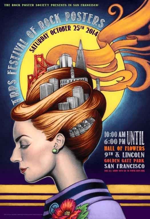
That TRPS time of year. 2014 Rock Poster Fest next coming up..
Its almost time of the annual TRPS (The Rock Poster Society) poster event in Golden Gate Park. The big event is staple in the Bay Area poster scene and features a slew of the original old-school Fillmore/Grateful Dead artists that really started the whole screenprinted gigposter culture. Along with the old cats are a ton of new-school artists including myself pushing the scene forward. There is plenty of psychedlia to go around…
I will have some new gigposters & art prints available for this show…
Artists & Vendors Lineup
Stanley Mouse
Wes Wilson
Bonnie MacLean
Chuck Sperry
Paul Imagine
AJ Masthay
John Seabury
Casey Castille
Emek
Lee Conklin
Chris Shaw
Alex Fischer
Lauren Yurkovich
Marq Spusta
Dave Hunter
Shane Grogg
Carolyn Ferris
Sal Dicheira
Kris Mikkelson
Victor Moscoso
Randy Tuten
David Singer
Adam Pobiak
Billy Perkins
Gary Houston
The event is Saturday, Oct. 25th from 10 a.m. – 6 p.m at the Hall of Flowers near the 9th & Lincoln entrance to Golden Gate Park.
For more information on the event (price, time, location, etc..) check out the TRPS website…
Wedding Invitation for me & some Lady…
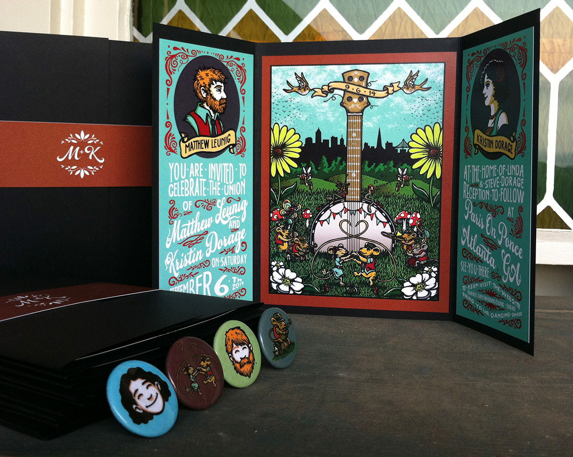
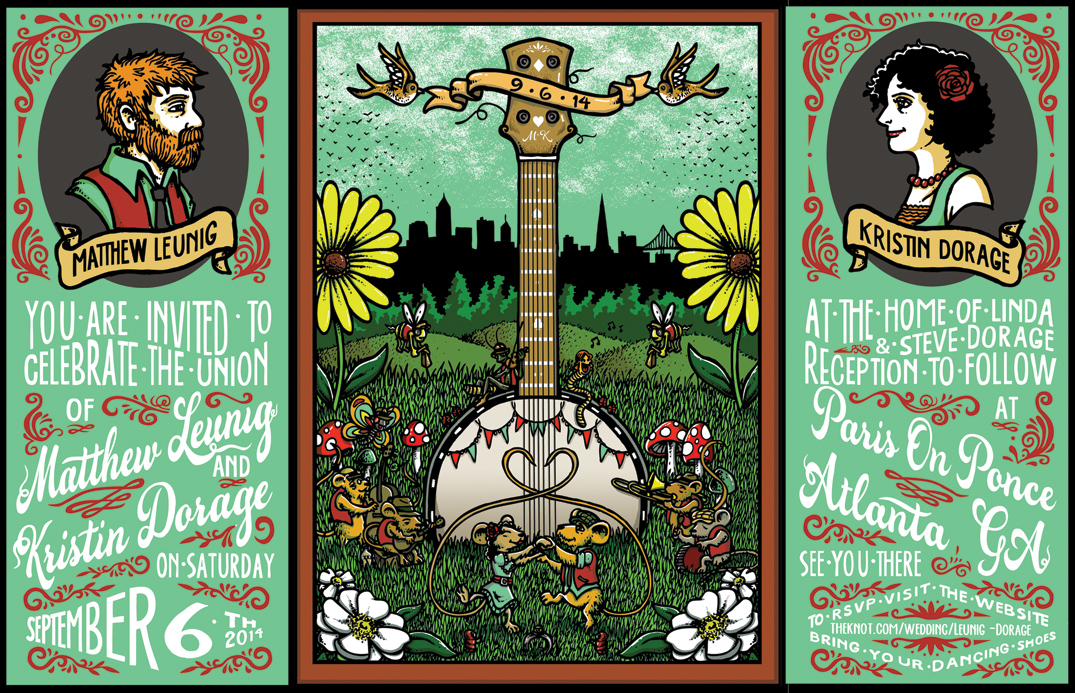
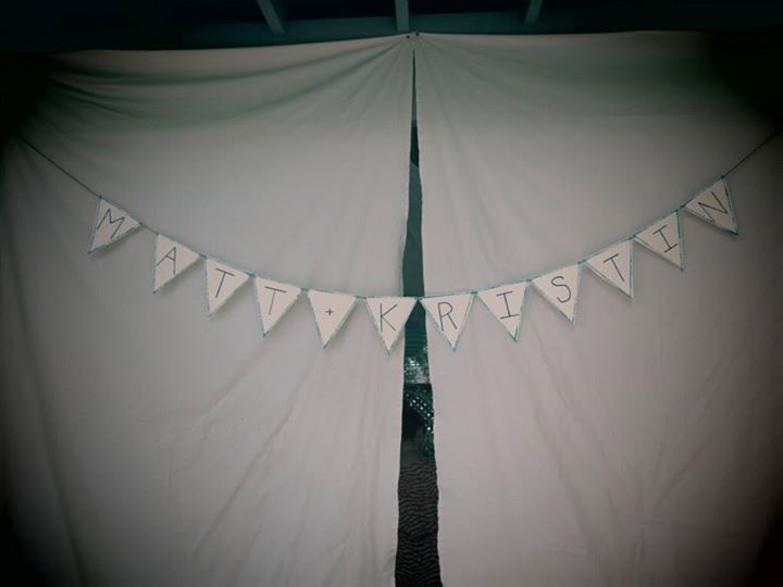
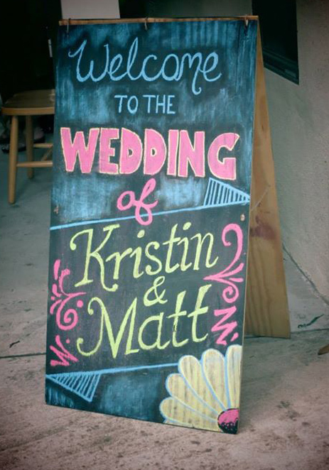
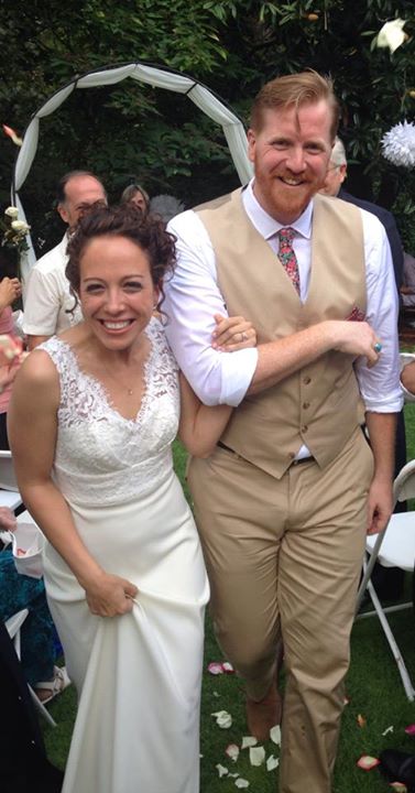
So a couple weeks ago I done gone git’ married to my amazing girlfriend of 6 years, Kristin Dorage down in her hometown of Atlanta, GA. It was a blast and a large relief once it was over. A culmination of a years worth of stress and planning. Being an illustrator/designer it was only natural that I design my own wedding invitation. I had done wedding invitations before as well as a couple wedding “concert posters” and kind of had an idea of what I wanted to do for ours. Our wedding would be pretty low-key, outdoors and the reception would take place at this sweet French-burlesque type club called Paris on Ponce. I got a great old timey, rag-time style band, Blair Crimmins & the Hookers, and that esthetic seemed to bleed into everything we did.
After looking at a ton of invitations online I decided to do a tri-fold with the center being the main image and the text on either side and was influenced by the layout of an invitation designer Elizabeth Baddeley had made for her own wedding. I soon found out that designing stuff for your own wedding is about 10x harder than for someone else. One becomes too much of a perfectionist. I must have gone through 15+ concepts but finally landed on the “musical field mice”.
I wanted the invitation to be colorful, fun, boisterous and express the vibe and imagery that we wanted people to think of… sunny green grass, broken banjo strings, shoeless dancing, bourbon-spiked sweet tea, loud brass, late night boas, etc…
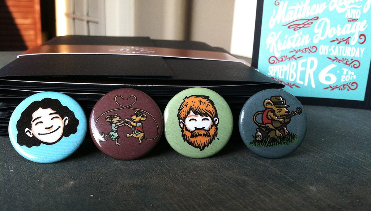
Along with the invitation I made a slew of knick-knacks like pins that people couple snag and wear. 2 of the pins were field mice from the invite and the other 2 were our faces taken from our “Save the Date” card which I had made at Purebuttons.





LATEST COMMENTS