

“Summer of Love” with the SF Opera
San Francisco is celebrating the 50th Anniversary of the famous “Summer of Love” this summer and many of the city’s large institutions (DeYoung Art Museum, SFMOMA, etc..) have opened exhibits showcasing old photos, psychedelic art, & music from the 60’s.
Not to be left out, the SF Opera too wanted to celebrate the Summer of Love by having all of their branding for the Summer season reflect this same psychedelic/flower-power style of art and I was thrilled when they contacted me for the job.
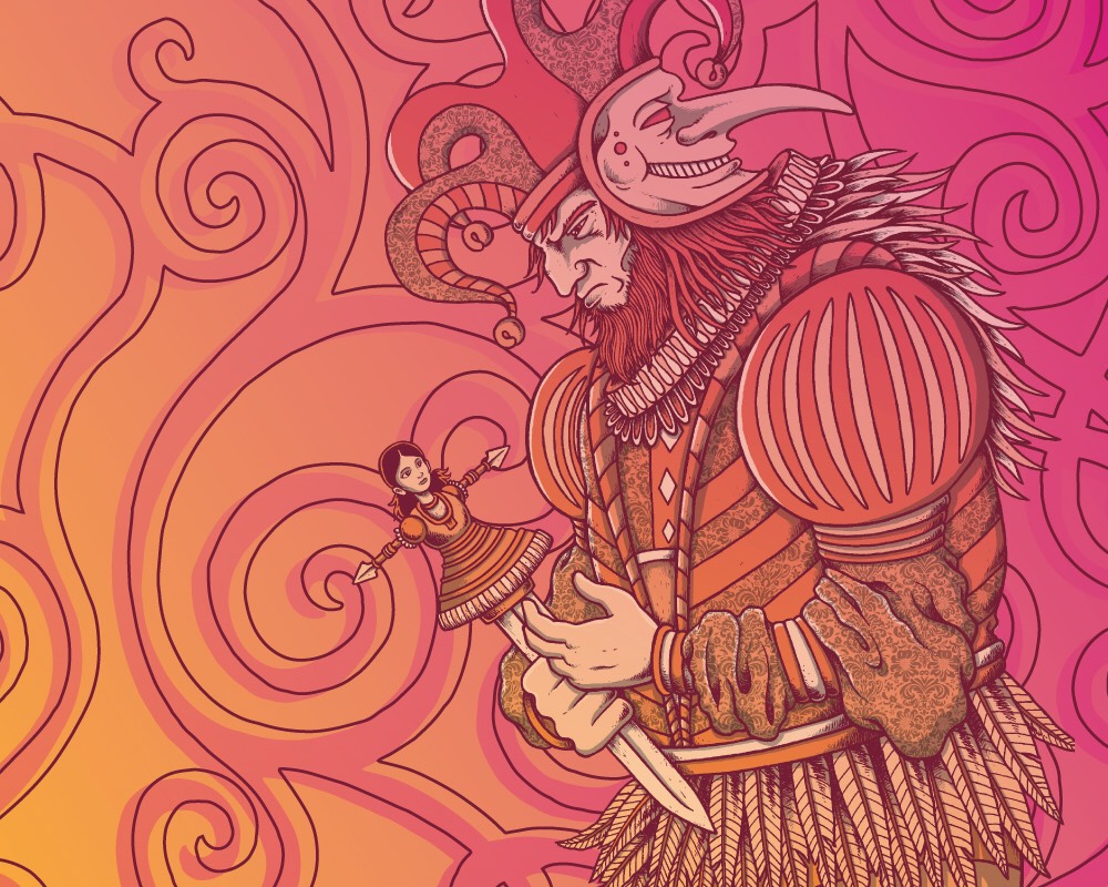
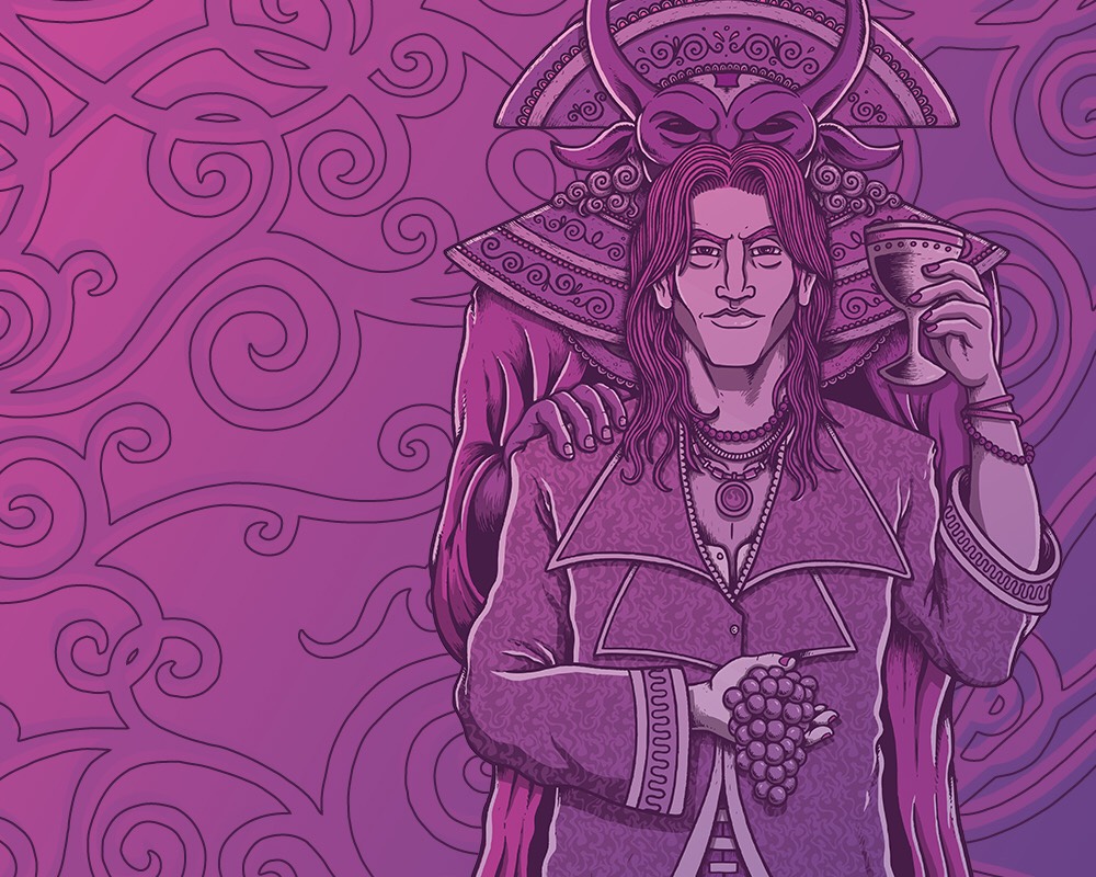
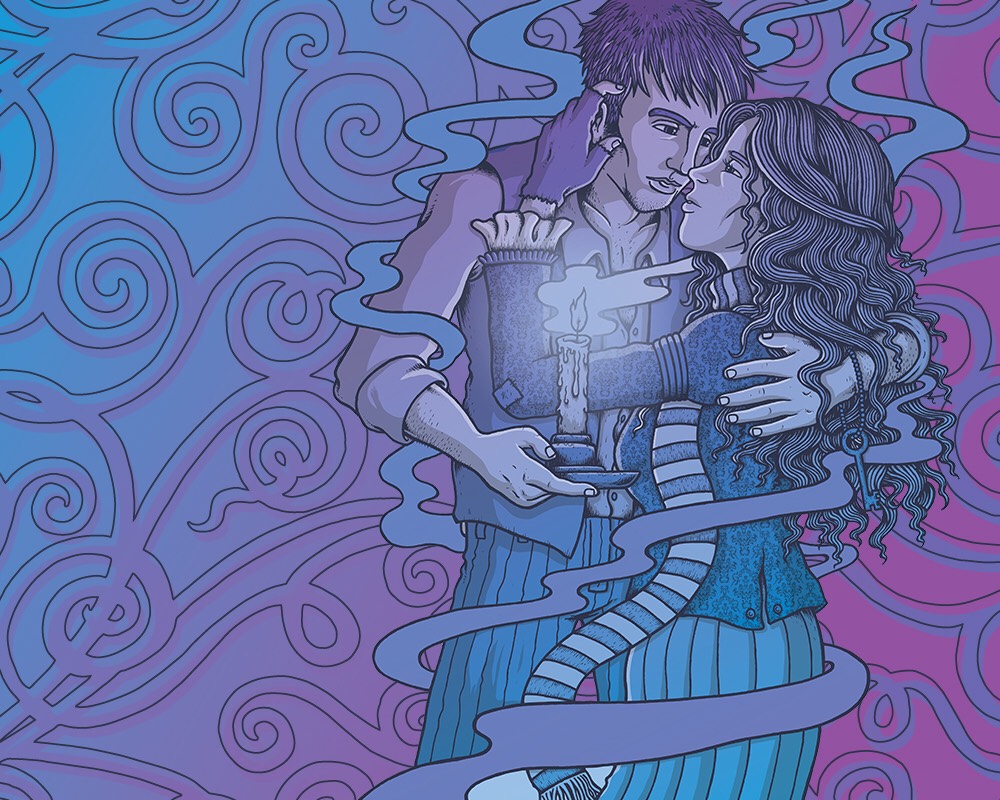
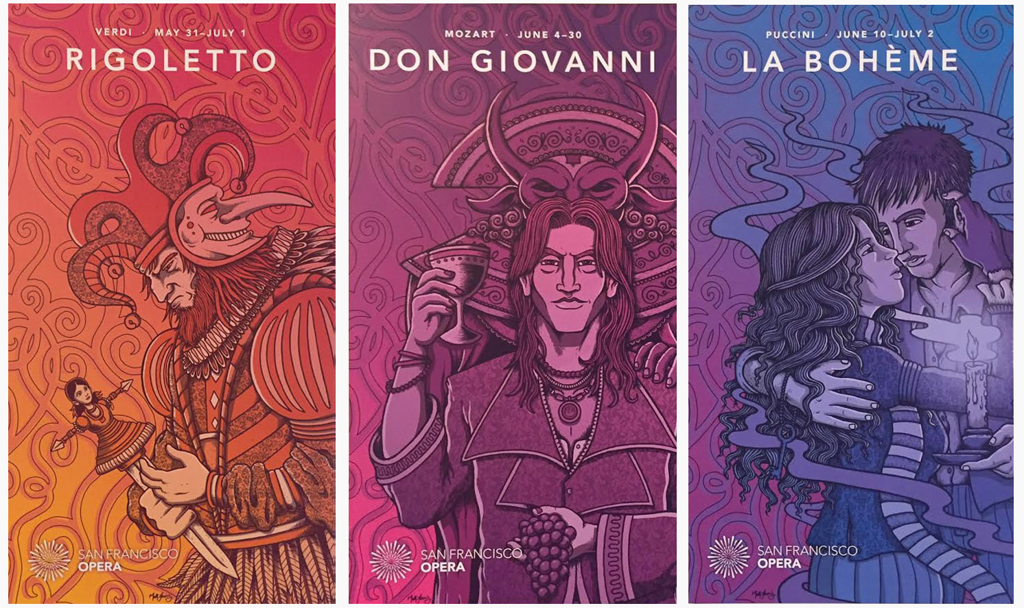
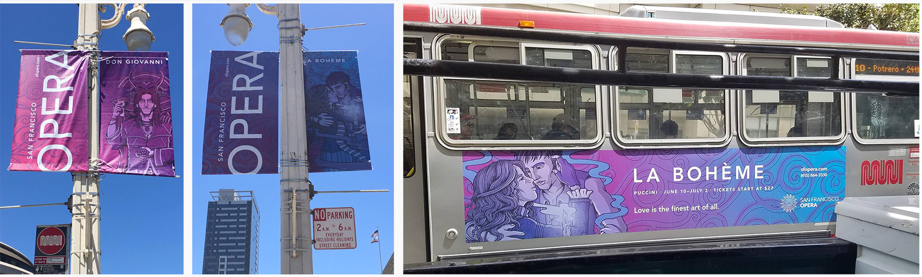
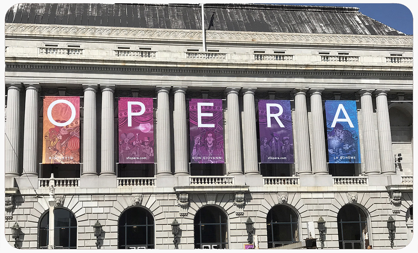
Working with Mission Minded, we created the look for their Summer campaign featuring 3 new productions (Rigoletto, Don Giovanni & La Boheme). This included telephone pole banners, metro/bus ads, print ads & fliers, merch and last but not least the huge pentaptych of banners outside the War Memorial Opera House.
 (Limited run of screenprinted art prints.. print run of 100/each)
I openly admit that when starting this job I knew nothing of the Opera other than Bugs Bunny cartoons and ended up doing a lot of research, not only into the 3 Operas in questions but into some historic Opera promotional art, posters, sets & costume design. I began to see, much like concert posters, the important relationship between the art & the music and how each productions had subtle (sometimes not so subtle) themes & imagery used to when promoting it.

We knew we wanted the art to feature characters from the individual productions and that the idea of “duality” was present through all 3. The design would be ornate and detailed but not too “hippy-ish”, and the implementation of patterns & the color would be the main factor pushing the whole “Summer of Love” angle. After a number of rounds of different poses & layouts, we locked down the 3 main designs. Not too Flower Power-y,… not too traditional… just right.

These had to work individually but also fit together when displayed as a 5-banner pentaptych set on the side of the Opera House which is where the idea of the “stage arch” came into play, keeping them all in the same world.

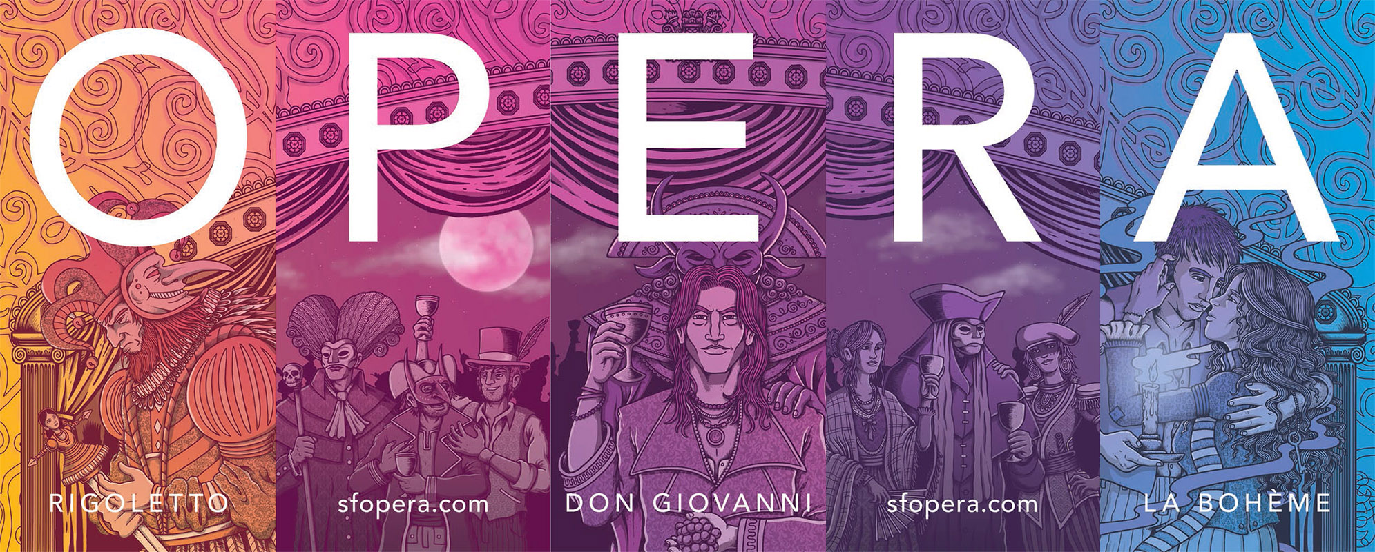
The arch was patterned after the actual War Memorial Opera House stage arch and the 2 remaining banners were filled out with “revelers” & background characters from the individual Operas.
While working on the final art I got a visit to the studio from General Director of the SFOpera, Matthew Shilvock, for a chat about some of the behind-the-scenes on how the whole process started, music & brewing beer (which didn’t make the interview).

I have noticed when working with larger institutions/clients there is the worry that they are hiring you because you are “an artist” and not necessarily for your particular “style”. Due to the amount of people involved the design begin to get stale and overly simplified. This was not the case working with the Opera as I welcomely received notes like “go trippier” & more “crazy detail”. The project was great to work all around on and I’m psyched with the final results.
I never thought the Opera would be an avenue my art-style could work for and am pleased to say it has broadened my horizon & audience for future gigs.


LATEST POSTS
- All Blog Go to Heaven..
Scraped Knee - August 6, 2024 - Dead & Company Burgettstown, PA poster 2022
Scraped Knee - July 17, 2022 - Phish print for Charleston, SC stop – 2022
Scraped Knee - June 9, 2022 - Billy Strings “Deja-Tu Experience” poster
Scraped Knee - February 10, 2022 - Eric Church Grand Rapids poster – 2022
Scraped Knee - January 27, 2022
LATEST B&W
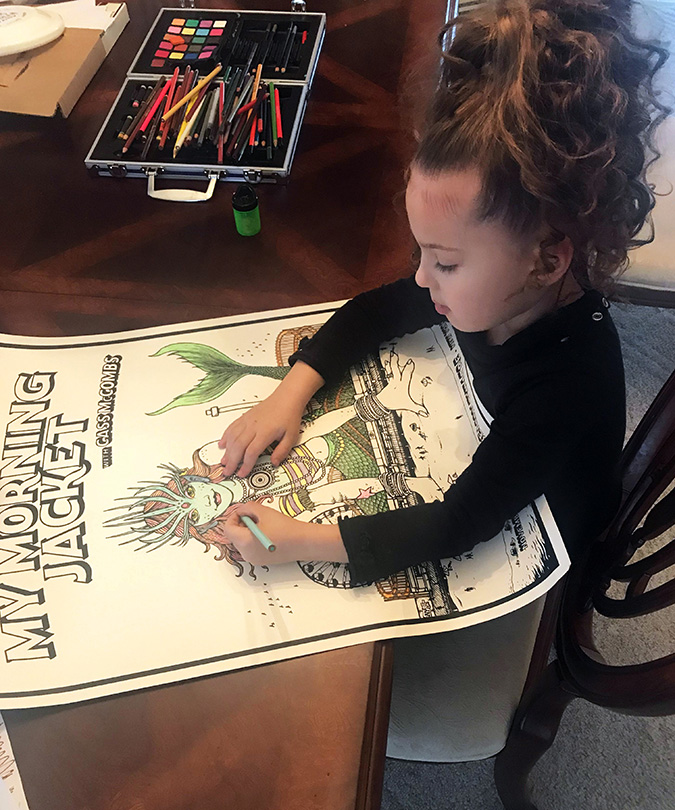
LATEST COLORING NOOK