Latest News
“Summer of Love” with the SF Opera
San Francisco is celebrating the 50th Anniversary of the famous “Summer of Love” this summer and many of the city’s large institutions (DeYoung Art Museum, SFMOMA, etc..) have opened exhibits showcasing old photos, psychedelic art, & music from the 60’s.
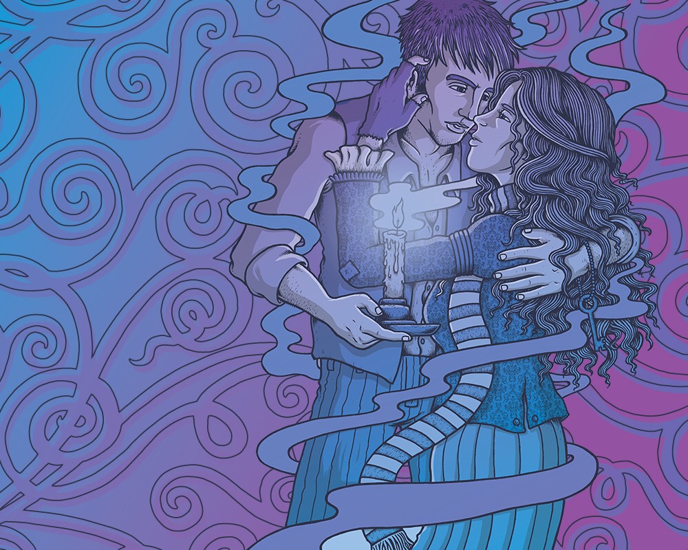
Not to be left out, the SF Opera too wanted to celebrate the Summer of Love by having all of their branding for the Summer season reflect this same psychedelic/flower-power style of art and I was thrilled when they contacted me for the job.
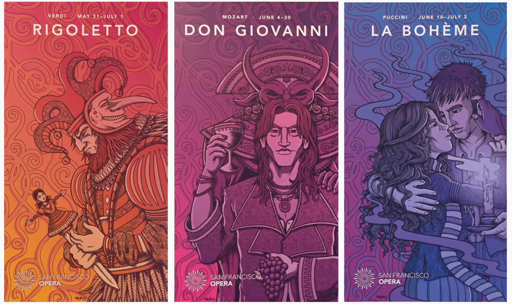
Working with Mission Minded, we created the look for their Summer campaign featuring 3 new productions (Rigoletto, Don Giovanni & La Boheme). This included telephone pole banners, metro/bus ads, print ads & fliers, merch and last but not least the huge pentaptych of banners outside the War Memorial Opera House.
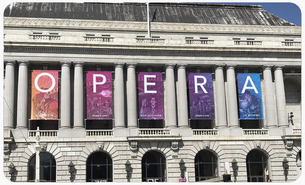
 (Limited run of screenprinted art prints.. print run of 100/each)
I openly admit that when starting this job I knew nothing of the Opera other than Bugs Bunny cartoons and ended up doing a lot of research, not only into the 3 Operas in questions but into some historic Opera promotional art, posters, sets & costume design. I began to see, much like concert posters, the important relationship between the art & the music and how each productions had subtle (sometimes not so subtle) themes & imagery used to when promoting it.
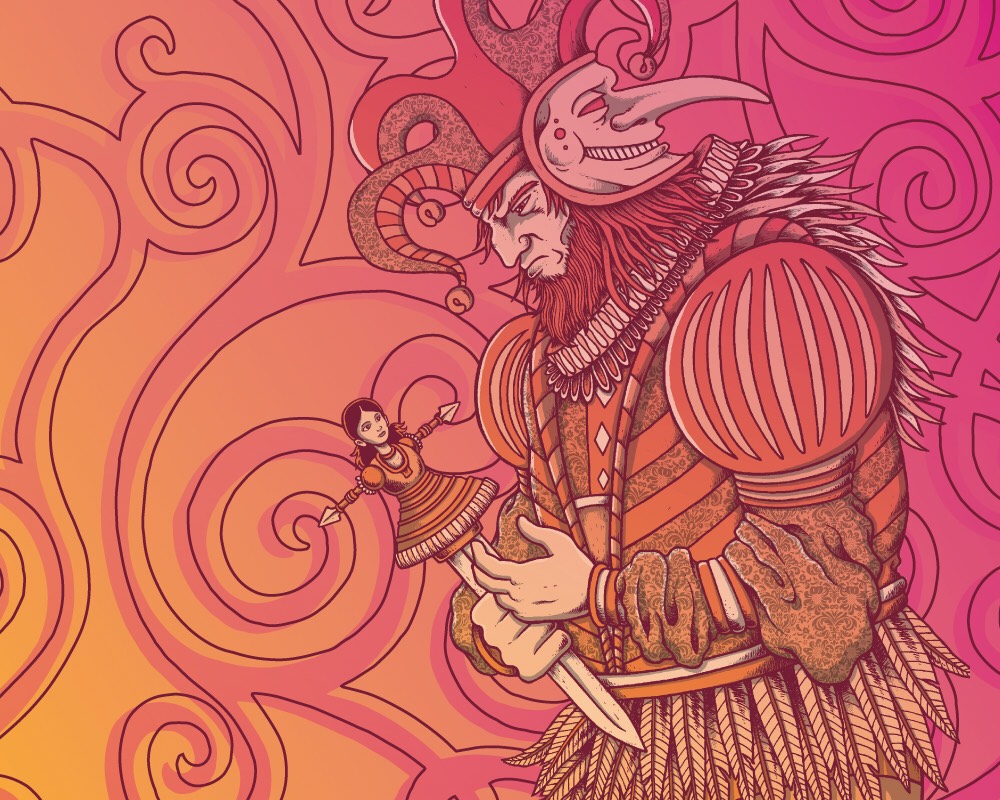
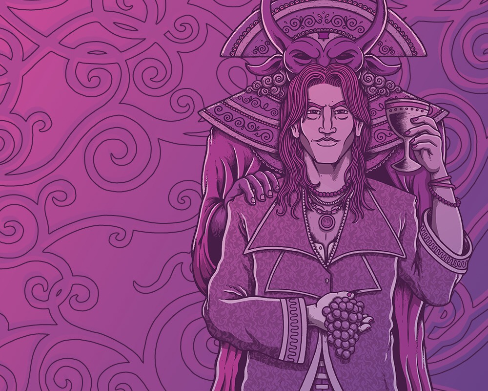
We knew we wanted the art to feature characters from the individual productions and that the idea of “duality” was present through all 3. The design would be ornate and detailed but not too “hippy-ish”, and the implementation of patterns & the color would be the main factor pushing the whole “Summer of Love” angle. After a number of rounds of different poses & layouts, we locked down the 3 main designs. Not too Flower Power-y,… not too traditional… just right.
These had to work individually but also fit together when displayed as a 5-banner pentaptych set on the side of the Opera House which is where the idea of the “stage arch” came into play, keeping them all in the same world.
The arch was patterned after the actual War Memorial Opera House stage arch and the 2 remaining banners were filled out with “revelers” & background characters from the individual Operas.
While working on the final art I got a visit to the studio from General Director of the SFOpera, Matthew Shilvock, for a chat about some of the behind-the-scenes on how the whole process started, music & brewing beer (which didn’t make the interview).
I have noticed when working with larger institutions/clients there is the worry that they are hiring you because you are “an artist” and not necessarily for your particular “style”. Due to the amount of people involved the design begin to get stale and overly simplified. This was not the case working with the Opera as I welcomely received notes like “go trippier” & more “crazy detail”. The project was great to work all around on and I’m psyched with the final results.
I never thought the Opera would be an avenue my art-style could work for and am pleased to say it has broadened my horizon & audience for future gigs.

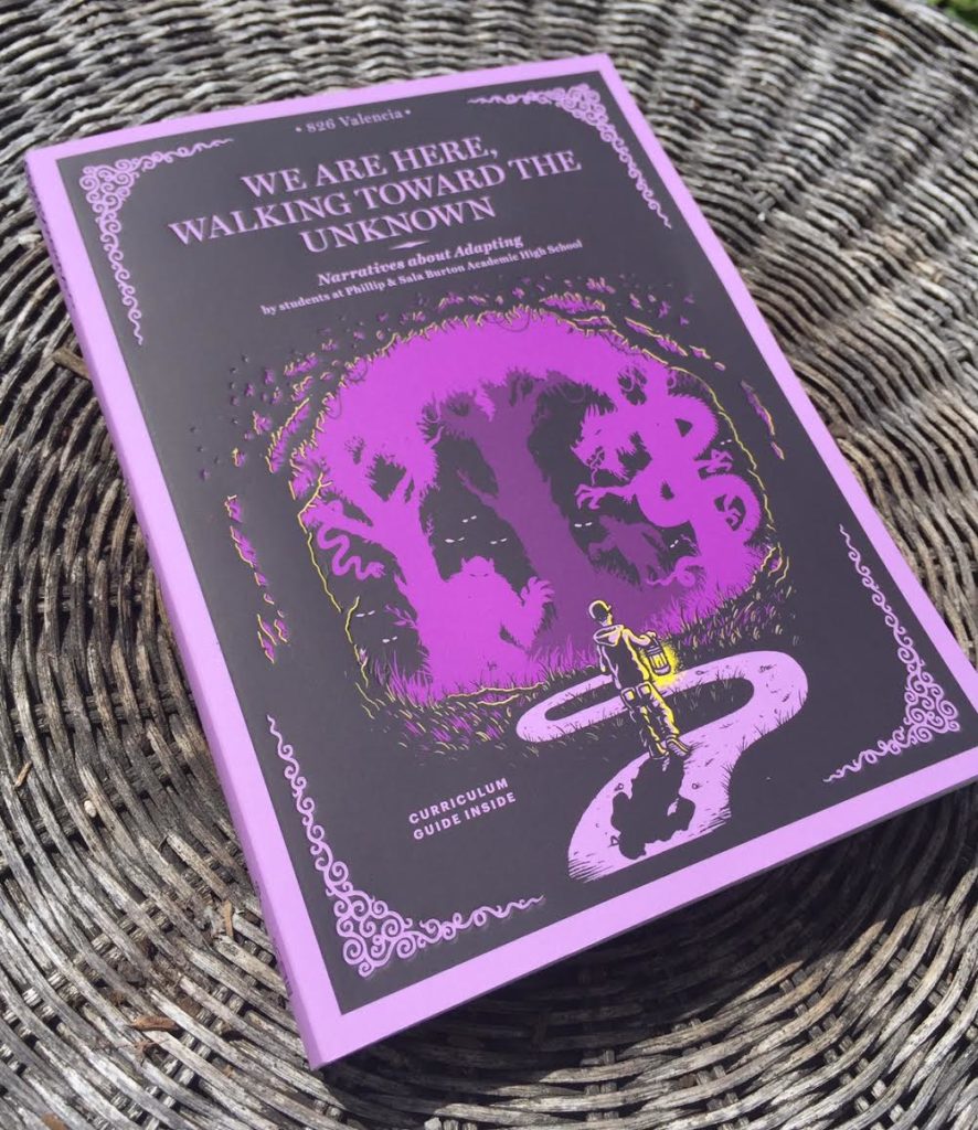
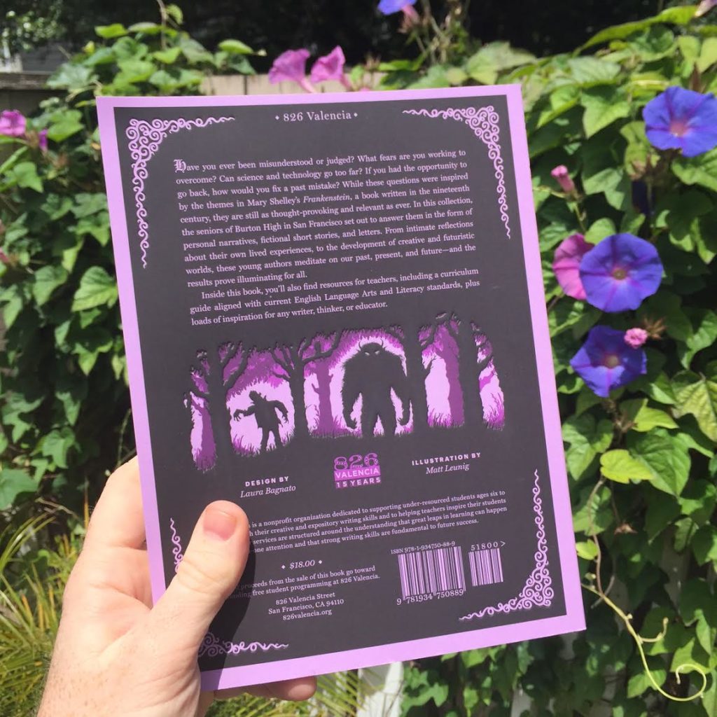
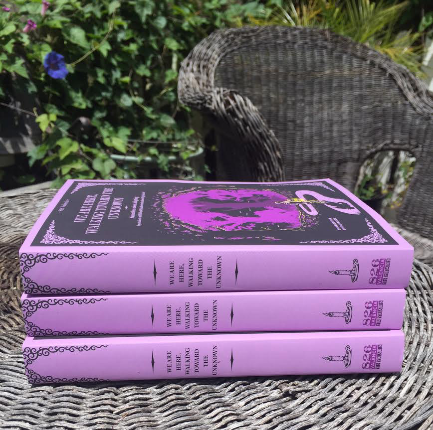
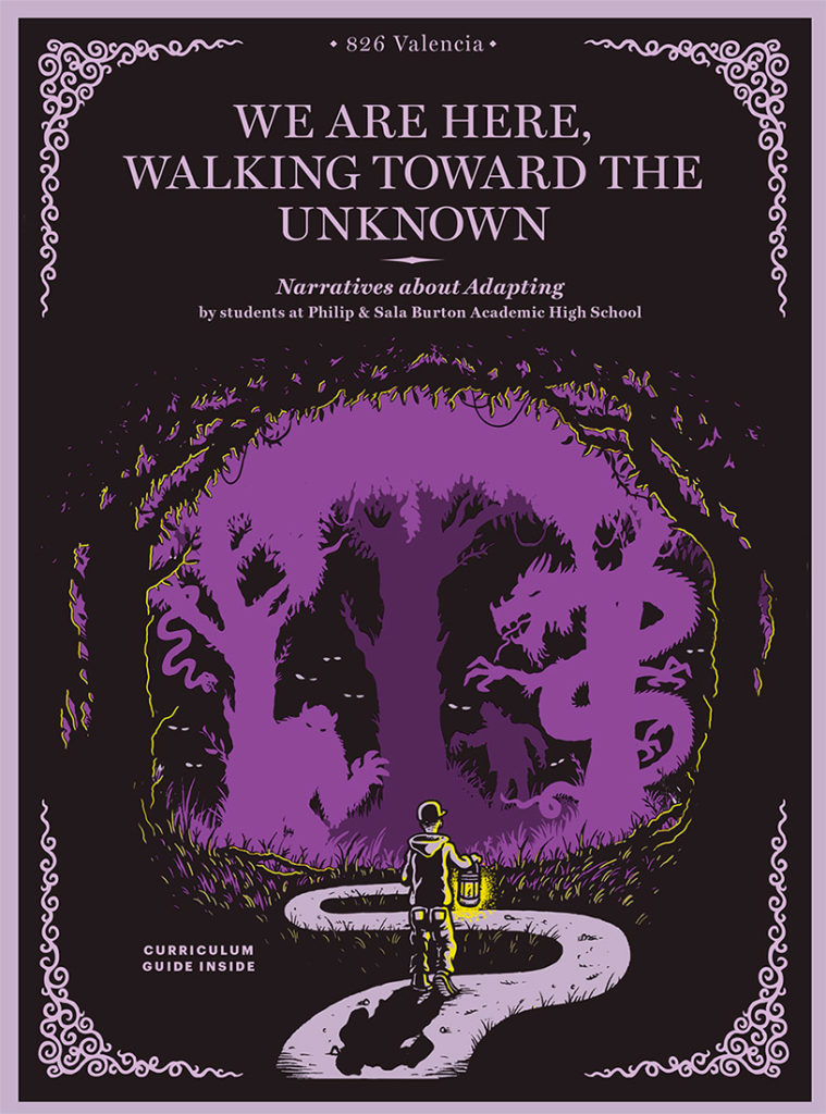
“We Are Here, Walking Toward the Unknown” book cover – 826 Valencia…
I recently finished up a project helping design a book cover & some interior illustration for literary non-profit, 826 Valencia here in the Bay Area. Every year they team up with a different high school and work with young authors to create an anthology of their work. The program includes tutoring and mentoring from 826 volunteers, many of which are published authors themselves and allow the kids to see their finished work in a proper published form and available in bookstores. I worked with them previously on a similar anthology years ago.

The theme of this years book was “The Unknown” which is fitting as a number of the kids involved are graduating, not knowing what is in store ahead. I was able to visit the high school and brainstorm w/ some of them on ideas for what they thought the cover should be and a lot of it came down to similar sentiments of “things aren’t what they seem”… “people can be monsters too”… & “facing ones fears”.
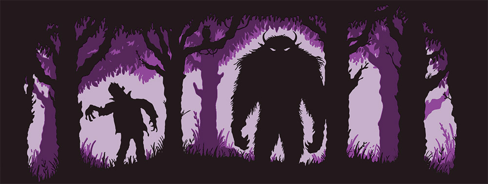
A lot of the stories had similar themes of conquering fears and facing the abyss of uncertainty and ended up being a perfect starting point when trying to conceptualize our cover. Working with the team at 826, we settled on the idea of a kid walking into a a dark forest holding a lantern surrounded by creepy silhouettes.
The interior illustrations were simple icons that acted as headers on certain chapters grouping them into 3 Acts, showing the passing of time. In the end the book came out looking great with a amazing layout by Laura Bagnato and featured a nice embossment of the forest line on the front/back covers.
![]()
826 Valencia is a great organization and has chapters all across the country (Boston, DC, NYC, LA, etc..) filled with mentors & volunteers helping spread their passion for writing & the literary arts.
Future Hendrix hits up Hartford, CT…. gigposter
I don’t tend to do a lot of hip-hop stuff these days mainly because it’s not really a “poster” scene, plus most bands or promoters I’ve come across seem to want the same old generic hip-hop imagery….. graffiti-walls, mics, bling, etc. When I got the call from Live Nation to do a promoter print for Future’s show in Hartford, CT I was familiar with a little bit of his work but upon finding out his deep interest in Jimi Hendrix I knew it was a gig I could work with. Hendrix’s influence goes so deep that he now goes by Future Hendrix and named his latest album, Hndrxx.
I am no stranger to 60’s psychedelic posters and took inspiration for this concept from some of the color schemes of old Jimi Hendrix posters as well as some of the amazing layouts by 60’s poster artists Bonnie Maclean & Randy Tuten. To keep the idea hiphop and make the whole thing sing, we worked in some Gold, adding some metallic ink into the mix.
The print is a 5-color screenprint (18′ x 24′) printed by the kickass folks at The Half & Half with a run of 50 for the promoter/venue, and I will have available a small run of 25 Artist Prints (signed/Numbered) starting May 24th @ 11am (PST).








LATEST COMMENTS